Overview
Having gone through an economic downturn, New Kensington in Pennsylvania is paving its way towards revitalization.
But the information related to jobs, training or social events is diffused on social media platforms and independent websites.
Sponsored by Forward Cities, the solution is expected to streamline the information and make it accessible to residents.
Type: Group Project (Team of 6)
Duration: 4 months
My Role: Lead Designer & Researcher - User Research, Concept Creation, UI/UX
Tools & Methods: Figma, Photoshop, Interviews, Co-Design, Competitive Analysis, Literature Review, Usability Testing
How might we connect the residents of New Kensington to right employment resources?
Problem space explained (Credits: TC Yang, Ussamma Bin Naved)
Solution
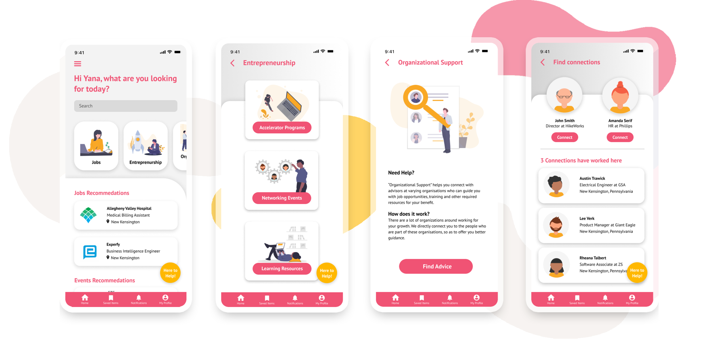
KenNext is a mobile app that connects residents with the organizations that are working towards revitalization as well as resources to support workforce, entrepreneurial, small business, and social service needs in New Kensington.
The goal of KenNext is to make job opportunities accessible, revitalize the local economy, hence improving the overall quality of life
Design Process
The project followed a Double Diamond Approach, conducted in four phases


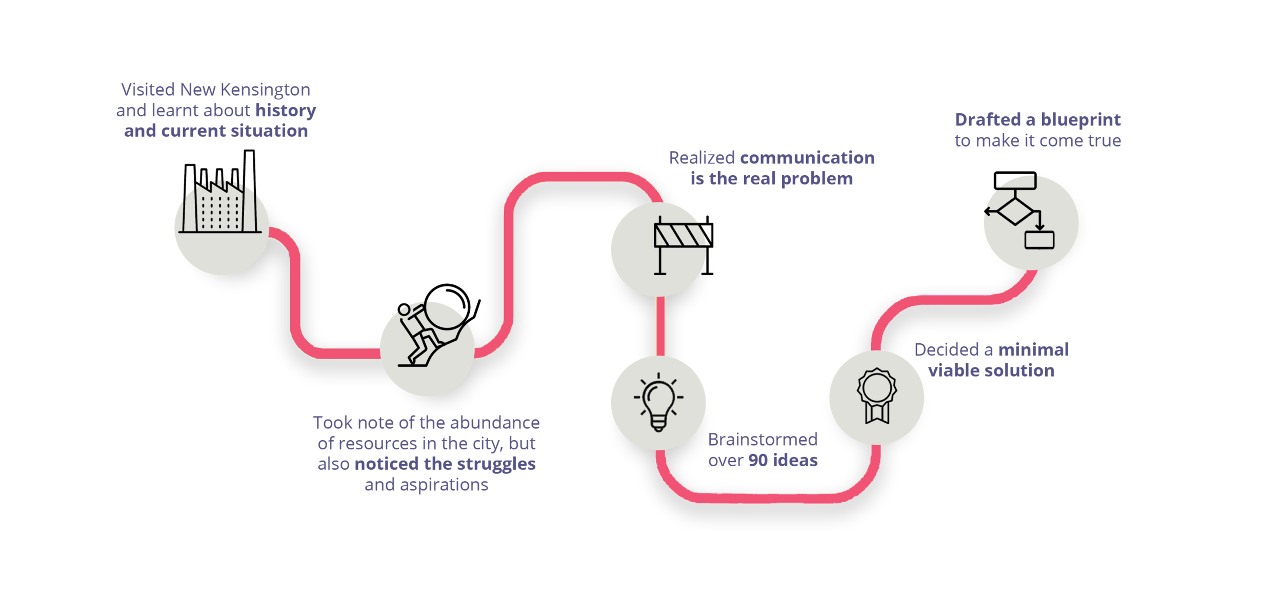
A recap of the process followed
I. User Research
The team conducted several field studies and used the following methods to conduct the user research:
Developing a stakeholder map and their direct and indirect relationships with the problem area
Conducting in-depth interviews with the stakeholders
Secondary research to understand the social, economical and political landscape of New Kensington
Stakeholder Map
Bridging the gap between organizations and residents required input from multiple parties. The team established a network of key stakeholders and narrowed it down to the critical relationships who have direct impact on the concerned situation.
User Interviews
The interviews were conducted with two broad groups: a) residents b) businesses.
During interviews and direct storytelling, the team asked the interviewees to share their daily routines through a journey map activity in order to obtain knowledge about emotion changes related to contexts. Some of the interview questions:
What are some of the struggles you are facing in the community?
How do you get to know about events in the community?
How do you find jobs? What resources do you use?
Secondary Research
A big portion of population, especially women, have low income
23% of the total population in New Kensington live below the poverty line, the national average being 11%. [1]
Female unemployment rate is almost three times higher than its counterpart.
More women (22%) participated in a food assistance program than men (12%) [2]
Current jobs in New Kensington are largely admin support and production.
The most common job groups, by number of people living in New Kensington, are Office & Administrative Support Occupations (747), Production Occupations (615), and Sales & Related Occupations (585). [4]
II. Research Synthesis
The research data was synthesized using affinity mapping and grouped into broader categories to derive insights, identify target users and product opportunity gaps.
Following are the key insights:
Communication channels are diffused
There are many social media groups or Facebook pages which leads to limited outreach of information.
Unfamiliar jargon creates friction
Usage of industry terms, as well as the overlap of information on communication platforms, results in friction in accessing the relevant information.
Little to no assistance to access resources
Residents don’t have a clear idea regarding who to reach out to for career-related advice.
Websites offer a frustrating experience
Many websites are not user friendly and are complicated given the people’s digital proficiency.


Target Users
Through the research, the team learnt that there are resources in the city but are not rightly connected to the ones who need it the most. Therefore, we have a primary and a secondary target user to address the problem from both ends.
Primary Target User: Underemployed / Unemployed Residents
Residents who are either unemployed or have a job which doesn’t pay as per their skills or interests.
Unknown to the means of reaching out to the required organization/resources.
[Assumption: This is just a starting point in order to scope down our study area but the end solution is scalable and will be able to serve anyone whose needs are aligned with the one identified via this research.]
Secondary User: Local Organizations
Many organizations in New Kensington are working to improve the current situation including non-profits, government agencies, university-supervised, etc. Their needs include:
Collaborate and build on each other’s effort to effectively reach to the target audience
Greater understanding of the target population and needy
Product Requirements
is approachable and demands low efforts from users
should comply with users' language and interests, avoid unfamiliar jargon, and offer guidance to users
focuses on diverse resources and transition to digital industry
is a digital solution that is low cost to implement
[Constraint: As provided by the client, the solution should be digital, low cost and scalable, that is accessible either on mobile or web]
III. Ideation
In the ideation phase, the team brainstormed multiple concepts using virtual white-boarding tools like Miro and Mural. The concepts were dot voted and the idea of centralized information platform or a mobile app was selected by the team and taken forward.
Brainstormed over 90 ideas using methods like Crazy 8, Silent Brainstorming, Worst Case Solution and Adding Constraints.
Why a mobile app?
30% of users do not have computer access at home, and majority of target users have a smartphone
Cater to better user experience, easy accessibility when on the move
Feature Listing
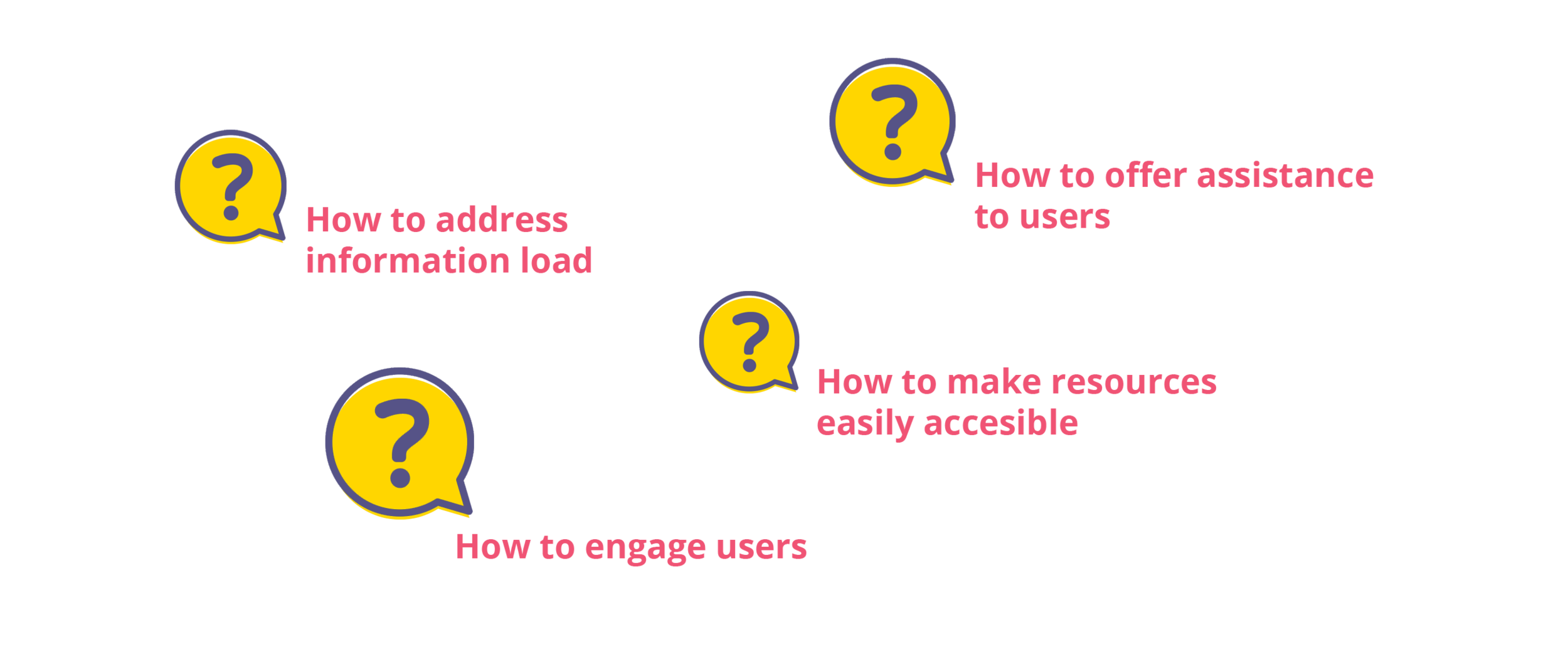
The idea was to simplify the user flow, and offer step-by-step guidance through the processes. Below questions needed to be address with the features.
How to make resources easily accessible?
Jobs
Workforce Training
Entrepreneurship
Social Services
How to offer guidance to users?
Mentorship: People from organizations can sign up to mentor users who need guidance.
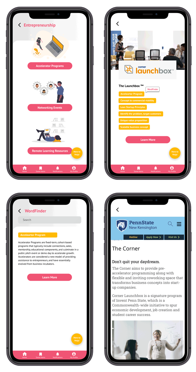
Word finder: Explains unfamiliar words and navigates users to relevant resources
Chatbot
How to increase user engagement?
Creating a professional network
Resource sharing
Inviting non-users to the platform
Information Architecture
The features guided the content requirements for the app. Each resource category was divided into subsequent pages and content that would serve the user’s end goals.
[Click on the image for enlarged version]
Mid-Fidelity Mockups
User Testing
The mentor feature (ambassador program) was questioned because training would be required for mentors to avoid anyone signing up for a mentor to consider the authenticity of profiles on this platform. Also, it would be difficult to make people commit to the platform in the initial phases.
Revision: In the high fidelity version, the team changed the mentor feature to an ‘organizational support’, where users can reach out to organizations by sending a text if they need any assistance.The chatbot feature was mistaken as someone wanting to chat with the user
Revision: It was removed since organizational served the purpose.
There should be a way for me to store jobs or resources somewhere to check them later.
Revision: Introduced a ‘save’ feature for resources.
“I should be able to check out the area where the job is located and not filter them using the proximity”
Revision: The job description page had a location feature similar to how Airbnb displays the location of stays.
IV. Final Prototype
Community Building
Allows users to invite both the existing as well as the non-users, to share the jobs, events and training opportunities that aligns with their common goals.
Wordfinder
This feature help users in explaining unfamiliar words as well assist in navigation by directing them to related resources available online.
Create a network
Allows users to connect with people who are working towards the same goal, or who have already explored that pathway.
Organizational Support
The floating icon called “Here to help” aims to resolves the issue of information load by providing guidance to users by connecting them to someone from organisations.
Click on the prototype to experience KenNext
User feedback
“I help many people use their phones, but it is inevitable in future and a pity to miss out. If this app could be simplistic enough, it could serve as a practice to guide these people to use the new tool. ” -Amy Lanz
“Pandemic have changed the landscape. Lots of recent unemployment. People will find it useful. ” - Kevin Snider
Takeaways
This remains to be one of the most impactful project that I have worked on so far in my UX career. I went on to work as an intern with Forward Cities during the summer and worked further on this project, where I collaborated with Wahila Creative to develop the app, focusing entirely on the MVP. Some of the takeaways:
Assumptions are subjective to change and should be validated before taking them into account in the solution phase. We started out by considering single mother as our primary target user but soon realized that the solution is necessary for the entire community, irrespective of any demographics.
It is critical to prioritize the features and start out with a Minimal Viable Product. The team realized that there are multiple resources that could be delivered to the community using a single platform but scope down to only important features as resulted out of usability testing.


